EdTech Dashboard and Onboarding
Project Overview
The Problem
The client ( NDA ) is an ed-tech company that empowers leaders to make data-driven decisions by creating personalized dashboards.
The onboarding process takes 3-6 months and the goal was to create a new, efficient onboarding experience and dashboard for IT/Data professionals. Their dashboards are also hard to customize and require ad hoc tweaking; this solution solves user-independent dashboard creation and customization.
Impact
Through user research, prototyping, and usability testing, the final product accomplished the following:
reduced the amount of time it takes to onboard while waiting for data clearance
demonstrated the need for increase real-life data examples in the dashboard creation process
leveraged and highlighted the current training tutorials to engage users while waiting for the data usage agreement to finalize.
Target users
K-12 School IT Professionals
Team Size
4 UX Consultants
My Role
UX Designer and Researcher
Responsibilities
User Research, User Interviews, Research Synthesis, Wireframing, Prototyping, Usability Testing
Final Prototype
Understanding the problem 🔬
The industry and problem space was new to the team, so we began our discovery period by aligning with the client on KPI’s, understanding their product’s current onboarding process, and refining the scope of work.
Stakeholders’ perspective
Using our weekly client sync-ups, we wanted to define:
What the client believed the onboarding process should look like
How the client defined the current onboarding process was
Through this, we broke the onboarding into 3 phases:
Sign-up and account creation
Connecting to data provider API’s
Dashboard creation
We also confirmed their KPI expectations.
KPI’s
Increase Customer Satisfaction of CSAT to 4.5/5
Reduce onboarding time to 9 mins
Easy Data Source Connection
-
• Create a new intuitive onboarding experience
• Incorporate self-service support content
• Exploration for free dashboard templates
• Selecting dashboard templates
• Plug-in creation for data integration
• Communicate with Dash.edu for any bugs
• Incorporate their daily tasks into the app.
-
• Desktop Application
• Client Data Unavailable for Ingestion for at least 1 Week
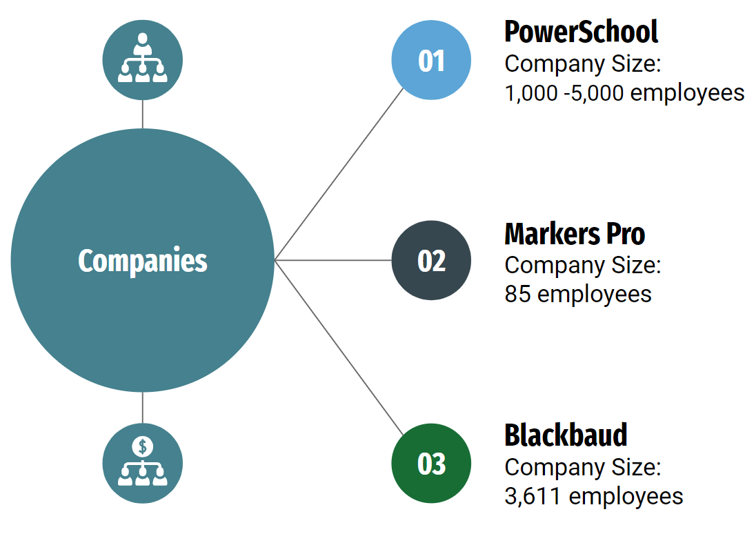
Understanding how competitors dealt with data challenges.
In order to understand the product better, we decided to look at other competitors and how they measured up to our current KPI’s.
While were able to look through training materials, demo videos, and customer reviews, this approach only allowed us to determine the styling expected from the market. We still needed more data on how competitors completed their onboarding and data connection process looked (which was behind a paywall).
Research: Leveraging the users’ experience
This was the most valuable data we gained while learning about the problem space. We could ask the users to walk us through their experience with the current client product and their competitor’s product.
The objective was to understand:
What are the most effective ways to onboard IT and Data Leads?
What are the pain points for IT and Data Leads during the onboarding process?
Number of participants
4 users
Research Method
34 Question Interview, with 4 Likert ratings
Organization Role
IT/ Data Professionals
Regions
California, New York
Quantifying the users’s sentiment
We asked users to rate their experience with onboarding, the overall product, the current dashboard, and how long they thought it took to onboard. Quantifying their responses helped parse how the users felt about different parts of the current user experience.
Most Interviewees rated Dash.edu’s Onboarding 3.25 out of 5.
Most interviewees rated the whole Dash.edu product an average of 4.12 out of 5.
User expectations on how long it took to establish data integrations ranged widely. The range of expected time was 2 hours to 2 months.
Due to their Dashboards being in process, half of the interviewed users couldn’t fully use their dashboards yet. Users with Dashboards give an average rating of 3.25 out of 5
“I think signup should be on the onboarding process day one.”
“My best experience probably has to be
that one where I know I can just reach out and get help.”
What did we learn? Key Findings 🔎
It takes users longer than expected to finish setting up their dashboards, the range was 3- 6 months.
This user group showed engagement when discussing customizing dashboards, using samples and templates, and reviewing documentation.
Dash.edu could provide strategic planning tools, realistic sample data, report sharing, and customization options to add value to the IT/Data Lead Users
In order to best onboard the IT/Data Leads, providing them with consistent communication and learning materials is important. The user group stressed the desire to learn about the product independently before using it.
Dash.edu could provide strategic planning tools, realistic sample data, report sharing, and customization options to add value to the IT/Data Lead Users
Main Takeaways:
The users wanted flexible dashboard customization and confirmation of the delay in finalizing or creating dashboards.
Defining and Synthesis 📔
Empathy mapping and finding patterns
The user interviews were coded in Miro and grouped by the categories on the right.
Getting the to root of the matter…
I wanted to understand why the current onboarding and dashboard process took a long time. To do this, I used a 5 Whys exercise to align my understanding of the pain points.
5 Whys Chart exploring Why onboarding setup takes long time.
We know that part of the reason for the delay in onboarding was the time needed Data Usage agreement. But we also confirmed that Dashboard creation was also a choke point because of the long wait time. And this creates an opportunity to design around this limitation and empower the user.
Setting the stage
Using the data we collected from the user interviews and from our Empathy Mapping, we created a user person to contextualize the user group.
Following the breadcrumbs…
Once we had the context, goals and motivation, journey maps were helpful to focus our design efforts and reorganize the current information architecture.
From this, we discovered, that the biggest delay caused the most friction for users. And this was an opportunity to design an experience that mitigated the anticipation.
Page Building with Information Architecture:
The user flows were key in creating the base for the information architecture for the new product. The image below shows the process of site mapping using user flows.
The Process
Ideation and Iteration
Wireframing
After several rounds of ideation, we were finally about to begin wireframing.
Testing Phase
Tested Prototype
Primary Research: Usability Testing
Objective: Identify any issues in the following userflows.
Signup
Onboarding
Dashboard Setup
Data Connections
Troubleshooting
Number of participants
4 users
Testing Method
4 pre-designed tasks and 5 question user survey
Usability Findings
The results from the usability tests were positive, 4/4 of users found the new prototype easier to use.
All of the users tested considered the prototype very intuitive and did not need the help of a technical person to use the app.
However, usability issues were found in the heuristics and signifiers. For example, some of the progress indicators could use clarification, such as the one noted on the right.
Distinguishing the Sign up screen from the log in was important as well.
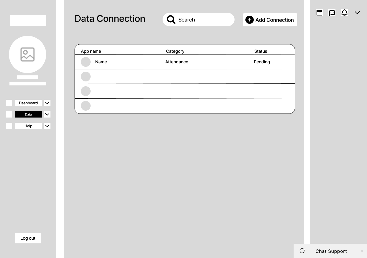
The Data Usage Agreement status was also a key finding in the usability test. For the next iteration, it was important to indicate this while users are creating data connections.
The Data Usage Agreement status was also a key finding in the usability test. For the next iteration, it was important to indicate this while users are creating data connections.
Future Direction & Lessons Learned
Next Steps
Further testing and developing Calendar Function
A pop-up assistant for complex troubleshooting
More Dashboard customization options.
Lessons Learned
Alignment: We learned throughout the process the value of making sure that the designers and stakeholders had a shared understanding of the terminology and the different back-end processes.
Communication: Setting expectations on communication was critical for working on team, especially when different time zones are involved during tight timelines but also during periods of rest.
Ambiguity: Organization and flexibility are two key tools when dealing with a new problem space.
Team Dynamics: Collaborating on a team with different work styles means realigning to a common goal. Also understanding what another team member helps resolve tension.


